
Role: UI/UX Designer
Tools: Figma
Date: 2023
SADA (Healthcare Management)
As the sole UI/UX designer on this project, I owned the end-to-end design process—from initial discovery to final handoff. Due to a Non Disclosure Agreement (NDA) signed during my time at SADA of various projects, I'll refer to this client work as "Healthcare Management." Working closely with a project manager, a team of engineers, and, most importantly, the client stakeholders and their users, I translated complex business needs and user pain points into a cohesive and efficient solution.
The Healthcare Management tool is a SaaS platform that helps hospitals manage patient data from a wearable device. It provides insights to staff, and the company offers both the devices and the software to their customers.
The Challenge: Modernizing an Enterprise Healthcare SaaS Platform
Enhance the outdated user interface and convoluted workflows which were causing frustration for both internal staff and hospital clients. The platform's inflexibility was hindering the company's ability to onboard new clients and scale their operations. My goal was not simply to modernize the look of the tool, but to transform it into a scalable, intuitive platform that would support the business growth and empower five distinct user types.
Discovery & Problem Framing
Through direct conversations and observations, I began my work by diving deep into how people were actually using the current system. I conducted one-on-one interviews and observed users as they interacted with the product, asking questions to understand their workflows and challenges. This hands-on approach was key; it quickly revealed that the platform's fragmented workflows were creating significant friction.
After talking to and observing all five user types, I focused my initial research on the System Administrator. This user type was the most important and had key issues that were similar to the problems faced by other users. From these direct insights, I identified three core pain points. These findings became the foundation for updating the design, which helped improve the user experience and address key problems in the product.

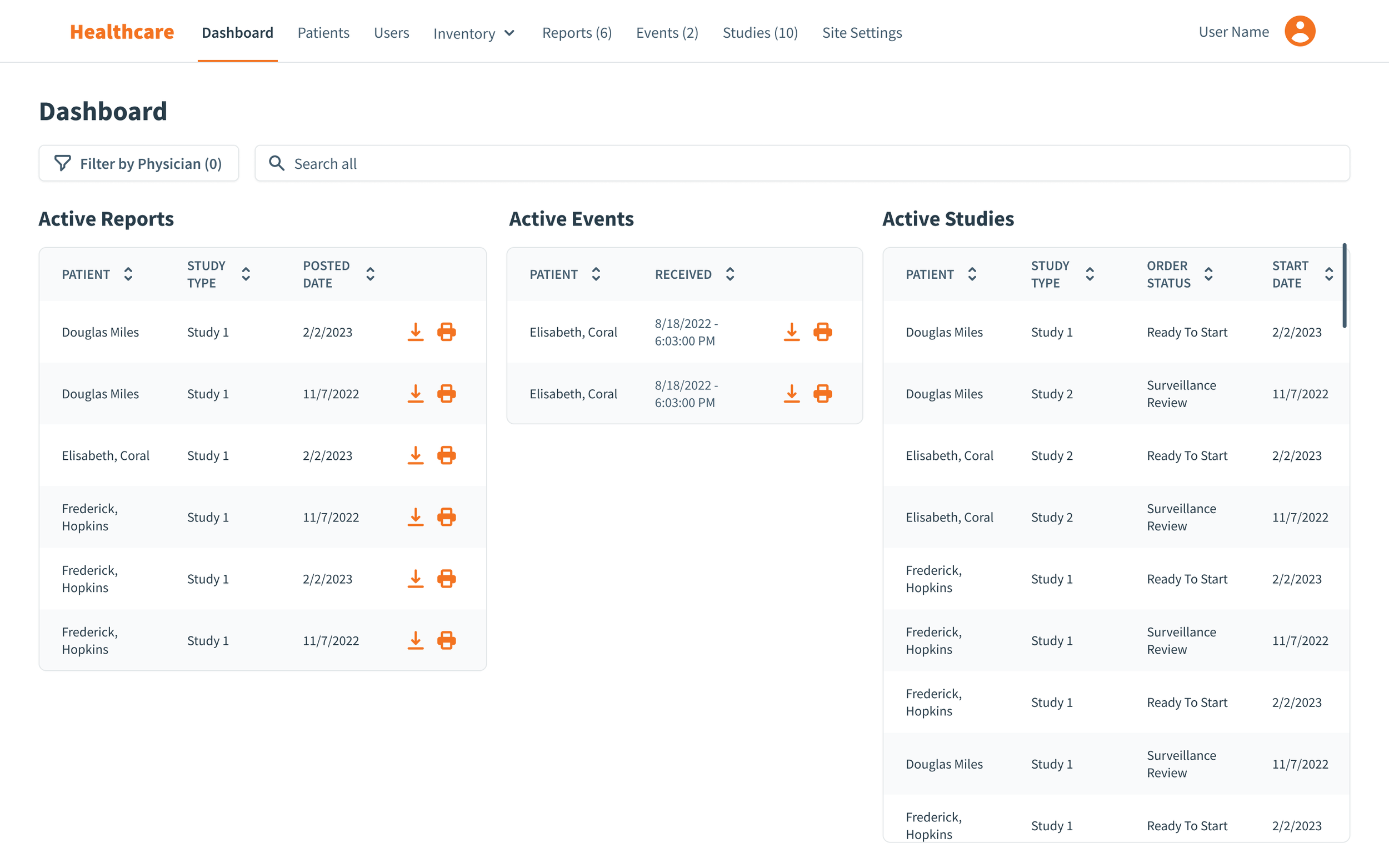
1. Inefficient Data Access (Dashboard): Users complained of a lack of relevant information on dashboards and in tables. For example, a System Administrator described having to open multiple tabs just to verify which hospital a specific site belonged to, an avoidable waste of time.
“We currently have no problems with how it works, but would like the dashboard to provide more meaningful information to our users.”
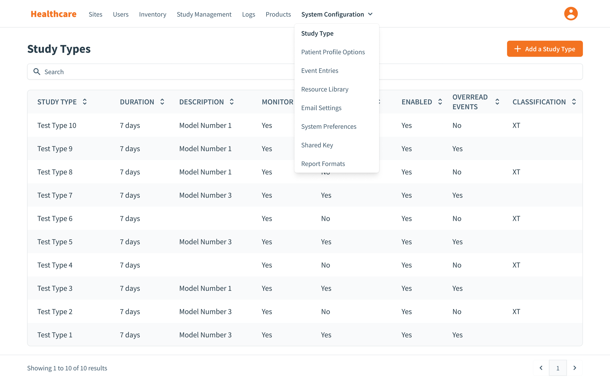
2. Streamline Navigation: Key actions, like creating a new site, were hidden within a nested dropdown, which makes functions and discoverability difficult. Overall the purpose of all items in the navigation bar needed to be reviewed.
“When we onboard new customers, we would Create a New Site from the Sites dropdown to complete a form. After a site is created, it's managed by our customers.”


3. Poor Usability (Create Site): The forms were a major source of frustration. A chaotic layout with inconsistent spacing, excessive scrolling, and a haphazard mix of radio buttons and checkboxes made data entry a tedious and error prone task.
“New employees usually struggle to complete this on their first try. We would like to organize this page a little more, but most importantly reduce scrolling as much as possible.“
My Approach:
A key constraint like any legacy product redesign was the users’ attachment to the existing workflow. While they wanted improvements, they were wary of a complete overhaul that would force them to relearn everything. This meant the redesign needed to be a thoughtful evolution, not a radical new design. My role was centered on user advocacy and strategic collaboration. I was responsible for:
User Research & Synthesis: Conducting interviews, analyzing feedback, and synthesizing insights to define a clear problem statement and design requirements.
Ideation & Prototyping: Create interactive prototypes to test design solutions with users.
Design System Creation: Build a new design system using Tailwind CSS to make sure we could keep the designs consistent and make it easier to add new features down the line.
Collaboration: Partnering with the project manager to scope and prioritize features, and collaborating with engineers to ensure technical feasibility.
Design Solutions & Implementation
Drawing from our user research, internal discussions, and key findings, I’ve address some design solutions, identified pain points, and value to the new user experience.

1. Enhanced Information Architecture & Table Design
Based on user feedback, I redesigned the table views to provide crucial, context rich information directly on the main page. I added new data points like city and state to site names, which allowed System Administrators to easily differentiate between multiple sites belonging to the same hospital at a glance. This small but impactful change eliminated the need to click into individual records, significantly improving efficiency for their most frequent task.
2. Intuitive Navigation
I eliminated the clunky dropdown menu for creating new sites. Instead, I introduced a highly visible, clear "Create Site" call to action (CTA) button on the main sites page. I also integrated a search bar, allowing users to quickly find existing sites, further streamlining their workflow and reducing time on task.
3. Optimized Input Fields
To tackle the cumbersome data entry process, I restructured the site creation form. I implemented logical categorization, breaking down a long, overwhelming form into digestible sections like "Clinic Details" and "Study Types." This not only reduced scrolling but also lowered the cognitive load. Additionally, I reviewed every input field, ensuring consistent spacing and using the most appropriate input types (e.g., radio buttons for mutually exclusive options) to improve clarity and reduce data errors.
Additional Design Samples:


Design Outcomes & Impact
Improved Operational Efficiency: The enhanced tables and navigation made key tasks like site creation faster and more efficient for System Administrators and other users. By eliminating unnecessary steps and surfacing critical information, the new design streamlined their workflow and reduced the time it takes to get things done.
User Centric Design: By actively involving users in the feedback loop and designing with their existing workflows in mind, we delivered a product that felt familiar yet significantly improved. This approach mitigated user anxiety about change and ensured a smooth adoption process.
Visual Consistency: I used a minimal number of font styles to keep the design consistent and uncluttered. This approach kept the experience cohesive and prevented the interface from feeling too busy. Content was structured to be read easily from top to bottom and left to right, following a grid system to create a visually pleasant and organized interface.
Objective Branding: The design used branding colors objectively, reserving the most noticeable color for UI elements that were the most important to users.
Scalability: The new design system I created will serve as a reusable component library, enabling SADA’s team to build future features with speed and consistency. Taking scalability into consideration, this sets a solid foundation for continued product growth and ensures the platform to meet future needs.
Effortless Content Flow: I structured the content to be read easily from top to bottom and left to right, following a clear grid system. This approach minimized user eye movement and allowed their focus to flow naturally through the most important content and priorities, creating a visually pleasant and organized interface.